Over the summer I’ll be making some infrastructure changes to the Throwing Stones website to improve its look and usability. Some minor changes I’ve already implemented; for example, there’s now a section in the right sidebar labelled “For beginners” that highlights previously-posted articles on clothing, shoes, jackets, and so on. I’ve also highlighted our Open House, coming in October, and set out the dates for the 2011-2012 season.
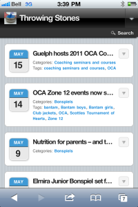
The major change I’ve made to the site will be noticed if you’re using a smartphone, such as an iPhone or Blackberry Torch, to view the Throwing Stones site through your smartphone’s browser. Instead of showing the usual Throwing Stones main page in your iPhone’s Safari window, it will appear looking like a typical iPhone application, using a blue theme instead of red:
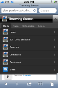
The advantage of the new smartphone display is that the displayed type is larger for easier reading, as are the links, so that navigating through the site with your touch screen works well. Access to main page topics is via the down-arrow menu button at the top:
Finally, in this image you can see what a single article looks like on iPhone, with the larger type for easier reading:
If you like, you can toggle between the iPhone view and the site’s ordinary browser theme. The switch to do that appears on the bottom of each page.


