This article is joint work with John Newhook of Dalhousie University in Halifax.
It is well known that the number of rotations given to a stone, particularly at guard or draw weight, will impact both the duration of the shot and the stone’s trajectory as it travels down the ice. Upon release, a stone will have its maximum angular, or rotational, velocity (think number of rotations per second). Just as the speed of the stone slows with time, from this point until it stops, so does the stone’s rotational velocity. A “soft”, or gentle, application of angular acceleration (torque) to the handle upon release, with a relatively few number of rotations, tends to cause the stone to curl more, and sooner. Often such a release will cause the stone to “dig in” and fall short of the intended target. In extreme cases – a “straight” or “lazy” handle – the stone can actually stop rotating completely before it comes to rest. When a stone has no rotation, its path is very unpredictable and sometimes it can even begin to rotate with the opposite rotation from that which was applied initially. Conversely, stones released with greater angular acceleration, sometimes termed a “positive release”, tend to travel on a straighter trajectory. Moreover, stones thrown with greater rotation will tend to carom even if they strike another stone “on the nose”, a consequence of the “gear effect” of the rotation.
Consequently, there is considerable benefit for all of the players on a curling team to throw similarly with respect to rotations for all of the types of shots a team might play. Behaviours of stones become much more predictable and both icing and line-calling are easier than if the players all deliver their stones with different rotations. Equally important is for the team to decide on how many rotations to throw as part of their team’s set of tactics. Team Rachel Homan of Ottawa, for example, is well-known for throwing their stones with a greater number of rotations than their competition, and given their success over the past decade it would appear these tactics are working well for them. Other successful teams, however, tend to throw with less rotation. The key for every team is for the players to throw with consistent rotations.
In our experience, coaching a competitive team – especially U18 or U21 teams – to deliver stones with consistent rotations is not easy. Part of the issue is that each player has to throw enough stones, of different velocities and turns – clockwise and counter-clockwise – to establish a large enough sample from which to determine a pattern. Then, rotations should be tracked through competition because competitive breakdown can lead to differences in deliveries, and one would like to address such changes as early and as quickly as possible. One of our particular challenges in coaching university-level athletes is that virtually all university athletes are members of their own junior-aged teams, and those teams’ rotation tactics may well differ amongst themselves and with our own idea for how many rotations the university team(s) should throw. Finally, explaining tendencies and comparing one athlete to another also is not straightforward, and conveying the information can be difficult. As an example, it is usually quite insufficient to simply say that “Ryan throws with less rotation than Andrew”. When does that occur? With all shots? Or only guards? With which turn? How about hit-weight shots, are the rotations consistent? Is Ryan consistent himself with his rotations between in-turn and out-turn shots, or does he need to work on his own rotational consistency? With which types of shots? And perhaps most importantly, how will we try to address and correct this inconsistency in practice, both with an individual player and across the team?
Measurement
For each throw to be recorded, we track two variables: the length of time it takes for the stone to travel a fixed distance, and the number of rotations of the stone over that distance. We use near hog-line to far hog-line as the constant distance, since each stone but for “hogged” stones will travel to the far hog line. Using this distance permits the tracking of a variety of all shots, from peels to guards, and largely eliminates confounding factors such as striking stones already in play. By counting rotations starting from the near hog line, we also ignore issues related to players’ releases themselves, and the release point of the stone during each throw, both of which are difficult to account for. It is worth noting at this point that the number of rotations between the hog lines is not the same number of rotations as we often refer to in other coaching or game discussions: commonly players discuss the number of rotations from release until the rock stops (or is out of play).
Throws are recorded in a simple Excel spreadsheet, organized so that each row in the spreadsheet represents four throws, one for each player. The burden of recording this data is significant for a coach already tracking their team’s game performance. Instead, we suggest that another skilled person, such as a parent or fifth player, is given the statistician’s role. Along with a laptop computer, the equipment required to track rotations is a stop-watch and, depending on the venue and sight-lines, a pair of binoculars. Paper can be used for recording if data entry must be deferred.
The greatest accuracy in measuring rotations is usually achieved from a vantage point above the ice, ideally from the side of the sheet, where one can accurately time each stone’s crossing of the near and far hog lines and consider the orientation of the handle when the stone crosses the near hog line to begin counting. With that initial orientation of the handle in mind, one can monitor the handle at the far hog line so that the count of rotations is accurate to 1/10th of a rotation. Often, however, such a vantage point is impossible. In typical cases stones are timed from the lounge immediately behind the sheet, so the statistician must make a judgement of the stone handle’s orientation at the near hog line, and count rotations to the nearest, say, quarter-turn. But even with this reduced level of accuracy we can still learn something. Once all of the data is entered into a spreadsheet, we get something that looks like this:
(Aside: sometimes shots are missed, they “pick”, they’re “burned”, or they’re “hogged”. We record all of the outcomes anyway to keep the data organized.)
So now we have data. But naively comparing large sets of numbers yields very little information. It is not only very difficult to discover tendencies from the raw values, but your athletes’ eyes will glaze over if you try to use the numbers alone to explain anything. Instead, we need a visualization approach and some elementary statistics to help make sense of it all.
Visualization
After sanitizing the data, eliminating missed shots and sorting the values as necessary for plotting, we can then create a visualization of the rotations as a scatter-plot, with the y-axis being the number of rotations and the x-axis representing each shot’s hog-to-hog time. It isn’t necessary that we use Excel as the graphing software; other packages, such as the freely-available Jamovi software package, will work just as well. If we create the scatter-plot (here using Microsoft Excel), we get something like this:
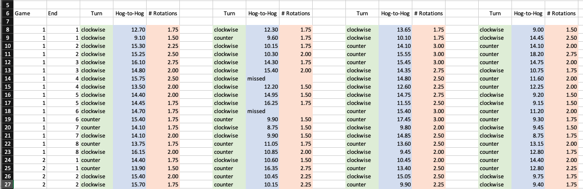
This visualization for Player A is a remarkable model of superb throwing consistency; near-identical amounts of rotation for both clockwise and counter-clockwise throws at all shot velocities, with very few outliers. In this case, rotations were tracked to the nearest 1/10th of a rotation from an ideal vantage point.
Statistical analysis
The scatter-plot for Player A above contains a linear regression model consisting of a trend line and an R-squared measure of correlation between hog-to-hog time and the number of rotations. The linear regression trend line provided by Excel is of the usual form y = mx + b where y is the dependent variable (rotations), x is the independent variable (hog-to-hog time), m is the slope of the line, and b is the y-intercept on the y axis. In the plot above, note that the linear regression lines are almost identical, signifying near-perfect rotational consistency. The R-squared measure, which can vary between 0 and 1, is a measure of the goodness-of-fit of the scatter-plot to the linear regression line. A value of R-squared that is close to zero means that there is very little consistency; a value close to 1 means near-perfect consistency to the trend line. In the scatter-plot for Player A, the R-squared value = 0.66 for clockwise throws (the blue trend line) and 0.76 for counter-clockwise throws (the orange trend line). These measures of 0.66 and 0.76 are high and signify very accurate, consistent throwing by Player A.
The slope of each trend line deserves some commentary. The slope m should always be a positive value, since draw-weight shots should have greater rotations for a fixed distance than hit-weight shots. A slope of near-zero means that, on average, just as many rotations occur for hit-weight shots as they do for draws; that is, the harder the throw, the greater the rotation (angular velocity) on release that is applied. Conversely, a steeper slope indicates that the player tends to throw proportionally more rotation with guard and draw-weight shots than what they would throw with hit-weight shots. In our experience, a slope m of between 0.11 and 0.16 is indicative of a player that on average throws each shot, regardless of velocity, with the same amount of rotation upon release. In our coaching this consistency is our training goal, particularly for younger teams. Our desire is to have players (and their teams) master a consistent release, regardless of the type or velocity of the shot, before they begin to adapt their release for any specific shot or circumstance.
Finally, it is important when trying to compare one athlete to another that the graphs use the same scale on both axes, so that the magnitude of the number of rotations can be compared visually across players.
Additional examples
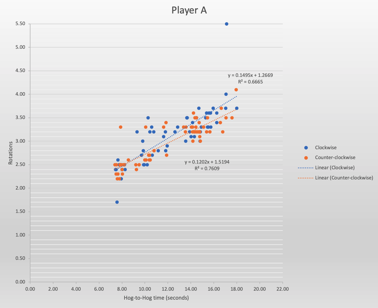
Below is another example of a player with very consistent releases. At the time, Player B was a U-21 athlete. In this case, rotations were tracked to the nearest 1/4 turn. Note as well that the overall number of rotations is considerably less than what appears in the scatter-plot for Player A above.
With Player B, the slopes of each trend line are nearly identical at 0.11, indicative of a consistent release and similar rotations across both turns. However, note that there are a greater number of outliers, and these are reflected in the lower R-squared values for both clockwise and counter-clockwise turns: 0.40 and 0.62 respectively. With this athlete, at this event, the consistency is largely present and very similar for both turns, but the training goal at practice would be to try to reduce the number of outliers. Going back to the raw data and determining if there were specific types of shots that led to the rotation issues might be helpful, for example a shot to the wide part of the sheet.
In this next example, Player C’s scatter-plot indicates there is some work to do:

With Player C, also a U-21 athlete, there is a dichotomy between the rotations thrown for clockwise and counter-clockwise shots. For the counter-clockwise turn (in orange) the slope of the trend line is in the right direction but more practice is required to reduce the variability. Once consistency improves, with fewer outliers the trend line should approximate a better slope, higher than the current 0.05 value shown in the plot. However, with clockwise rotations there are two clear problems. First, not enough rotation is being given to draw and guard-weight shots to avoid losing a stone, and secondly the athlete tends to apply even more rotation with hit-weight clockwise shots. A practice plan for this athlete might initially involve blocked practice [1] with in-turn, draw-weight throws to increase the amount of rotation for draw and guard shots, followed by random practice and tracking rotations for all shots, regardless of the shot’s velocity.
Finally, we consider the scatter-plot for this player, a U-21 lead:
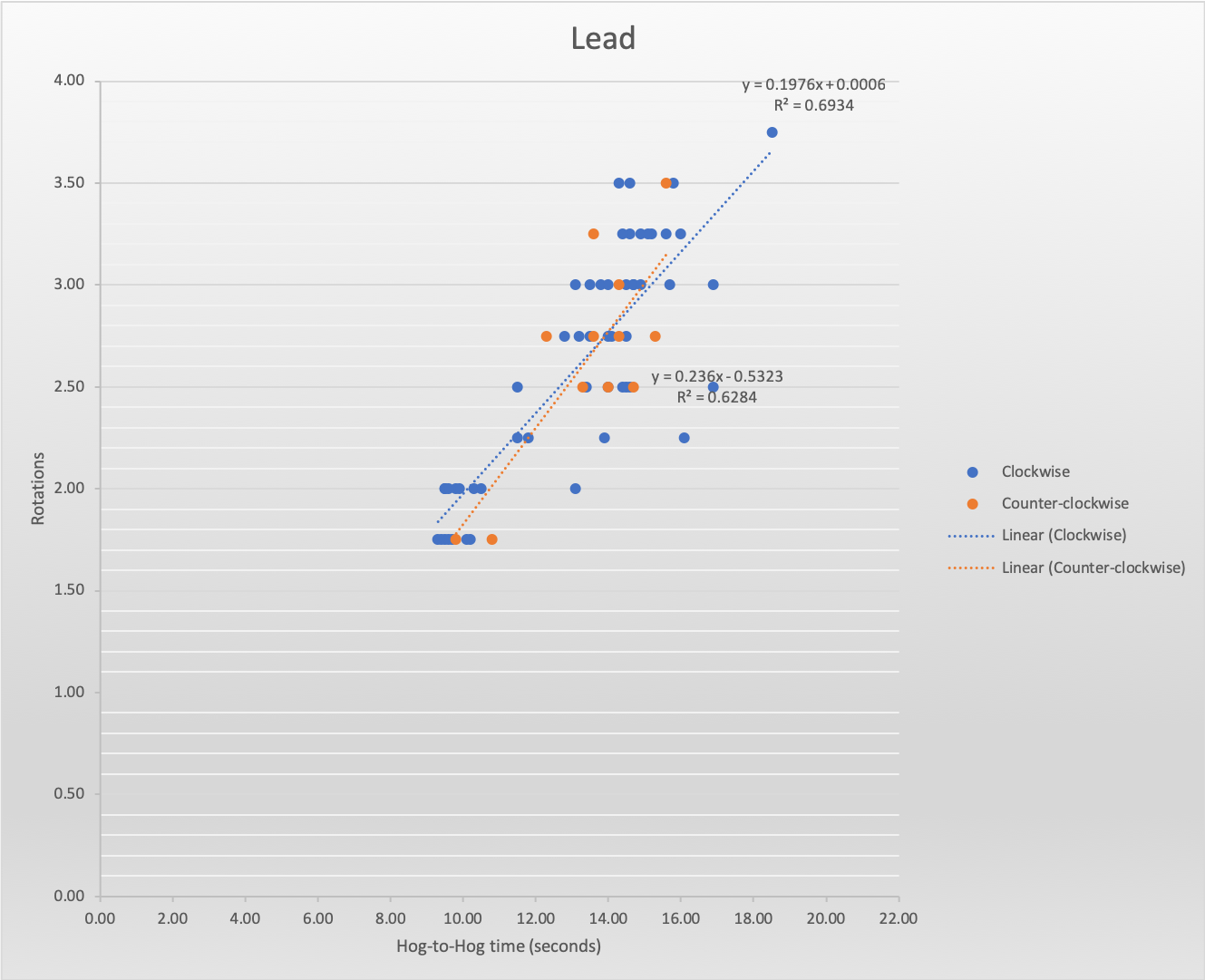
In this case, while the athlete shows very good consistency (R-squared values of 0.69 and 0.62 for clockwise and counter-clockwise throws, respectively) with relatively few outliers, the slopes of the trend lines are steeper than what we have seen with the other examples (0.197 and 0.236). This means that proportionally more rotation is being applied for draw- and guard-weight shots than what would be thrown for hits. This isn’t necessarily indicative of a problem, however; it may be quite deliberate and potentially offers an advantage in that guard-weight shots will less likely be lost because of a lack of rotation once the stone crosses the far hog line. Nonetheless it is helpful for both the athlete, and the team, to understand this behaviour going forward.
Summary
We have described the visualization and statistical analysis of the amount of rotation applied to a curling stone in order to determine a “rotation profile” for an athlete and their team, which we have written up as one of the articles in our coaching series [2]. Understanding an athlete’s tendencies is important and helps the coach develop practice plans to correct and eliminate inconsistent throwing through a competitive season. Obviously, while tracking rotations can play a role it is only a small part of coaching a delivery; tracking rotations alone says nothing about whether the athlete “hit the broom” on any shot, or threw the weight that was called for (this latter point will be the subject of a future article).
We believe that using visualizations is key in explaining technical material to athletes, parents, and other coaches, and it assists tremendously in understanding trends and tendencies that could go unnoticed if one merely looked at raw values. Capturing rotation data is relatively simple but can provide important information to a team and their coach. In particular, we note that:
- Visualization of rotations applied during deliveries using scatter plots is an excellent way to convey information to players on their rotation consistency.
- Quantitative modelling of rotation data is helpful to illustrate tendencies and is very useful in providing positive feedback to athletes when improvements are made.
- As with any statistical measurement, a sample of throws must be large enough, and must include a variety of weights (stone velocities), in order for rotation tendencies to be determined.
Finally, I would especially like to thank Heather Kiemele, mother of skip Mackenzie, who performs the role of statistician with Team Kiemele.
References
[1] Gary Crossley (February 2012). Blocked, distributed, and random practice as it relates to skill acquisition in curling. Available on the Ontario Curling Council website with this link.
[2] John Newhook and Glenn Paulley (May 2019). Stone rotation analytics. Technical Coach Series #13.